Hello everyone! I wanted to share some exciting updates about comiCSS.
Although you may have noticed some of them already.
First, I've revamped the website's navigation to remove the link to Twitter and replace it with one for
Bluesky. I haven't logged into Twitter in months, and I don't plan to return. And I am considering
removing that link altogether in the future. Social media-wise, comiCSS
is on Bluesky and LinkedIn, and there's no link to LinkedIn, so why have one for Bluesky at all? The link is in the
Contact page if you want to follow or reach out.
Second, I've launched the dark mode version of the website. It is automatic and based on your system preferences.
So you may already be seeing the dark mode if your system is set to that. If not, give it a try!
Last, but not least, I've started working on a new section of the website: comiCSS Games.
Over the past year, I developed a collection of CSS-based games (all are CSS-themed, some are 100% CSS without
any JavaScript), and I'm excited to start adding them to this site on a regular basis. Check them out.
Peanut Butter and the Jif That Keeps on Giving
A stunning discovery promises to shake up a long-running sticky debate online
Lexington, Ky. — In a statement released this week, the estate of William T. Young, creator of the
popular Jif peanut butter, announced the discovery of a handwritten diary entry detailing how the brand name
was intended to be pronounced. According to the entry, Jif was meant to use a hard "g" sound—"Gif," as in "gift,"
without the "t." The passage reportedly reflects Young's frustration with early mispronunciations and his desire
for a clear, unambiguous brand identity.
Following the disclosure, a spokesperson for Procter & Gamble (P&G), the company that currently produces Jif
peanut butter, said it is embracing the founder's original intent. In a brief announcement, Damon D. Jones,
Chief Communications Officer at P&G, encouraged consumers and advertisers to pronounce the brand name with a
hard "g," citing respect for Young's vision and the newly surfaced historical record.
The clarification adds an ironic twist to a separate, decades-old linguistic controversy: the pronunciation of
the GIF image format. Despite being spelled the same way, the format's creator has long insisted it should be
pronounced "Jif," with a soft "g," mirroring the traditional pronunciation of the peanut butter brand.
Language experts note that the result is an unusual reversal. Under the newly revealed guidance, Jif peanut
butter would now be pronounced "Gif," while GIF images would remain "Jif." "This is a necessary clarification
that will simplify conversations moving forward," Jones added.
Not everyone agrees. A prominent figure in the technology community, speaking on condition of anonymity, argued
that the image format's creator should continue to be honored. The source emphasized that GIF should still be
pronounced "Jif," but applying a hard "g" to the image format as well.
Whether the public will adopt the founder's preferred pronunciation remains to be seen. For now, a simple jar
of peanut butter has once again proven capable of sparking a surprisingly sticky debate.
Guess the Movie Solutions
Stuck in the game and need a hand? It's a HTML/CSS game, you could just inspect the code, you know? But,
if you want something faster and better, here's the solutions to all the puzzles:
...and a barstool in a completely different bar falls over.
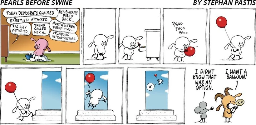
CSS Balloon
Today's comic is a longer comic than usual, and I was planning on
publishing it in a few weeks, but looking at the news cycle, I thought that just as well it
could be published now.
If it is familiar, it's because it is inspired on a comic strip from
Pearls Before Swine (by Stephan Pastis)
, in which Pig floats away with a balloon after watching the news:
Pearls Before Swine comic strip (source and copyright: Stephan Pastis)
Pearls Before Swine is a great comic and I've used it as inspiration in the past.
Having the component library makes it easier to create comics, and I decided to give it
a try at this comic strip, which is one of my favorites.
The idea is the same but, as always, just a shadow of what the original conveys.
Stephan makes it "positive", while mine may look like the character is jumping from
a window or something and have negative connotations.
Focusing more on the comic, I always like to include a note of color, in this case the
balloon and open sky are perfect for the regular black and white of the panels and characters.
Also, this is a cartoon about CSS, so I had to include it somehow: blowing the balloon,
it grows using scale (1, 1.1, 1.2...) and the character floats away with a translate:
Infinity Infinity... which is technically wrong (in order to go up it would need to be
Infinity -Infinity), but we are not going to be picky -not to mention that the Infinity
keyword cannot be used by itself (at least not yet) and it would need something like
calc(), min(), or max() to work.
I hope you enjoyed the comic as much as I enjoyed coding it.
The Old Way vs The New Way
I finally did it. I created a small library that lets me generate
this type of cartoons faster, without repeating code (or not as much) and I used it to
create next week's comic.
It's about doing things the "old way" (lengthier, simpler, craftier) vs the "new way" (more
complex, but faster after the fact). And an allegory to the library in itself.
Creating comics is now considerably easier, faster, and cleaner... But, at the same time, using
HTML5 web components feels like it defeats the purpose of comiCSS a little. It's no longer purely
an HTML and CSS project. This is because web components require JavaScript to work, even if they
are static (which is kind of ridiculous, but it is what it is.)
I "barely" started adding options, and because they compound, there are already over 3,000,000
different combinations:
75 mouths
25 eyes (working on this currently)
6 different hairs
5 different skin tones
5 different facial hairs
4 different ears
3 body types (mainly width, but I'd like to add some shapes too)
Some of them don't play nice with each other, so the number is considerably reduced (while still
in the thousands). I have also added props and accessories: tables, computers, notes...
As part of the web component, I also added a header with the cartoon title and a footer with the
comiCSS motto (slightly modified) and a link to the site (maybe I should add a link to Patreon and
other social media platforms.)
These cartoons are neat, I hope I keep getting ideas and expanding the library. One concern I
have is that I may see it as "complete" and stop drawing them altogether. Something like what
happened with the Batman CSS library.
Tanning solutions
This past weekend I played a little with the CSS trigonometric functions
while creating some CSS Art,
so I decided to do a comic about them!
And it's kind of a game: the comic has the names of eight trigonometric functions
from CSS, can you find all of them? Expand the section below to check the solution!
What are the eight CSS trigonometric functions hidden in the comic?
tan(): "tanning" (first panel)
atan2(): "a tan too" (second panel)
cos(): "coz" (second panel, this is phonetic)
sin(): "sinus" (second panel)
acos(): "such a cost" (third panel)
asin(): "a sin" (third panel)
atan(): "a tangerine" (third panel)
hypot(): "hypothesis" (fourth panel)
This last one is not necessarily a trigonometric function, but a generic math
one. Yet, with that name, I'll count it as one.
Were you able to find them?
If you are interested or curious in the trigonometric functions in CSS, you should check this
detailed article by Bramus.
CSS, Colors, and JavaScript
Some may say that if you have to explain a joke, then it is not really funny... I prefer to see it as a little
educational opportunity. So here's a short story about colors, links, and JavaScript.
CSS is the domain of styling, layout, and colors —this last one being a feature that has expanded immensely in
recent years. But did you know that JavaScript can read those styles, too? The getComputedStyle method
can be used to retrieve the final computed styles for a given element: margins, paddings, backgrounds, colors... or
mostly. There are some limitations, mainly due to security reasons, and today's cartoon
explores that.
By default, browsers display links in blue, and after being visited, they show them in purple. JavaScript being able
to detect these color changes could become a privacy risk. For example, a hacker could generate a list of links, make
a user visit the page, and then check which links have already been visited, essentially revealing the user's browsing
history.
To prevent this, the getComputedStyle method will always return the default styles for a link, even if it
has been visited. That way, attackers will not be able to detect if a link is purple and they won't be able to find out
if the person's browsing behavior.
Anyway, that's why CSS sees the link purple while JS still sees it blue. I hope you enjoyed the comic and, maybe, learned
something new about CSS and JavaScript. And if you want to learn more about the getComputedStyle method,
check out the MDN
documentation.
Everything is CSS
I originally published this cartoon on April 15, 2025. At the tme, I was reading
John Green's book "Everything is Tuberculosis" and I was really enjoying it...
so, in between chapters, I took a stab at recreating the cover with a CSS twist.
...Except the demos, sorry, they are still in CSS. I know it's cheating,
but the demos have the CSS embedded on the page instead of linking to an external CSS file.
So removing the CSS for the demos would be a big pain in the neck.
"Political" content
I just posted some "political" cartoons, that are done in CSS (as usual), but they touch on
topics that are not necessarily related to CSS (even when they are CSS theme). They are more
related to current events and, because of that, they'll lose meaning with time as people
forget about them.
This is a description for future reference of the cartoons. Maybe more of a reminder for me as
to why I did them.
Vibe Coding Keyboard. The latest trend (fad?) in programming (or more
accurately in technology) is "vibe coding." It is coding without coding. Telling an AI what you
want to build, and it builds it for you. Unfortunately for the vibe coders, right now the results
have been mixed. The comic is a keyboard with a single Tab button, which is not necessarily vibe
coding (using voice), but we won't get too picky. I wrote an April Fool's article
based on this cartoon.
Tariffs. The US government is imposing tariffs on China, and basically
almost every other country in the world based on the import deficit. And what web languages have
imports in them? JavaScript and CSS! So I made it into a fake news article with the headline about
JS tariffs. Silly but obvious.
Anyway, I hope I won't have to regret these comics and that they end up being forgotten. That will mean
that the news that look important now were not so impactful after all... We'll see.
#DECAFF #C0FFEE at 200 Degrees
Sometimes the CSS jokes write themselves, and they aren't even jokes but they actually look
good.
One example of this is writing words with hexadecimal colors. We can use the letters A, B, C,
D, E, and F; and then use the numbers 0 for an O, and maybe the number 1 for an I, and 5 for
an S... although that would be stretching it a little.
With that in mind, #DECAFF is a valid hex color (light purple), and
#C0FFEE is also a valid hex color (a light aquamarine). Creating a gradient
from one to another at 200 degrees actually makes for a great looking background.
Which is funny considering that the ideal temperature for coffee is 200 degrees
Farenheit (or 90 degrees Celsius.) Anyway. Just some silly decaffeinated CSS jokes.
Dad Jokes
This is a compilation of terrible CSS-Dad jokes I've been publishing online for the past few weeks. Be advised, they are mostly terrible.
What is CSS Developers' favorite drink? :root beer.
I must admit this is a PG version. After sharing this joke online the other day, I got some alternatives that also work for Web Developers:
#C0FFEE
strong .coffee { filter: none }
DOM Perignon
FlexBox wine
Why did the chicken cross the web? To get to the other site.
Me (a dad) when using animation-direction: reverse "Ah! This takes me back."
I was going to tell you a joke about negative animation-delay ...but you didn't get it.
Why did the CSS file go shopping for clothes? It needed a new style.
Why couldn't the Web Developer align the div? Because it was positioned off-the-grid.
How do CSS Developers stay on top of things?
They use z-index: max(Infinity);
Why do Web Developers have trust issues?
Because DarkGray.
Ok, this one does not really have a punchline (do any of them anyway?) But it is true:
in CSS, DarkGray is lighter than Gray. Which is interestingly annoying. Another weird fact
about CSS: the bolder font-weight can be lighter than the bold font weight. Because... CSS?
How do CSS Developers laugh?
Hue Hue Hue!
Why are CSS Developers always sad?
They never float on air.
Why does the CSS file never feel cold?
Because it always has an extra @layer
Why do people tend to avoid Web Developers?
Because they are just flexing all the time.
CSS Developers are great dancers,
they know all the steps().
How many CSS Developers does it take to change a light bulb?
None. It is a hardware issue.
How many CSS Developers does it take to change a light bulb?
None. They are Ok working on dark mode.
How many JavaScript Developers does it take to change a light bulb?
One. But they'll need 5GB in node_modules, TailwindCSS, their very own implementation
of the lefty-loosey-righty-tighty.js library, and the latest MacBook Pro to handle
everything. The resulting JS file will be 8MB and only change the light bulb if the
room has Chrome in it.
Why do Web Developers have a tough time getting a driver's license?
They pass the written or the driving test, but they rarely clear:both;
Brains are amazing. they work nonstop 24/7 from the moment you are born until
the moment you need to remember if it's align-text or text-align.
What is blue and not too heavy? LightBlue
And its even more terrible and nerdier version:
What is blue and not too heavy? #ADD8E6
What is CSS Developers' favorite car?
A vw.
How does a <div> dance?
It makes its border groove.
Why do Mobile Developers like going to McDonald's?
Because they have a hamburger menu.
How do Web Developers make a component hot?
They turn it 90 degrees.
Why did the last <div> blush?
Because it was next to its parent's bottom.
<input type="hidden">
hide-and-seek champion since 1995.
Fun fact: the type hidden was added to the HTML specification in 1995. This is
mostly useless information, but now you know it.
Why did the <video> element fail the test?
Because it didn't have a :cue.
CSS custom properties are in the :root of all evil (websites)
Why didn't IE11 talk to other browsers?
Because it didn't know how to <dialog>.
Another fun fact: Chrome supported <dialog> since 2012! But it didn't become a full part
of the standard until 2022. IE's end of life was June 2022, so that browser never
implemented the <dialog> element.
Why are CSS Developers so optimistic?
They can never see a glass half :empty.
Why did the ::before pseudo-element not show up to prom?
Because it wasn't contented.
What does HTML wear at parties? <address>
Why did the linear gradient fail the test?
Because it couldn't make the curve.
What's SVG's favorite TV host?
Doctor Fill.
Why do CSS developers only go to national masquerades?
Because masks can't go outside the borders.
This one is not 100% true. We can make a mask apply outside of the element borders by
setting mask-clip: no-clip.
Be kind to SVG files...
They have fillings too.
Why did the <img> tag go to jail?
It was iframed.
Why did the repeating-conic-gradient leave college?
It already had 360 degrees.
What element shows ::before after ::after?
A dictionary.
Why did the A11Y Coach not get the job?
They failed the background check.
What is a CSS Developer's favorite dessert?
Chocolate padding.
What is a web developer's least favorite car?
A bug.
How did the Web Developer become a bold shooter?
Practicing with a <B></B> Gun.
I looked for the perfect grayish-purplish color.
It took a long time, but I found it in a #DECADE.
What developers are always throwing a line?
Tech <br>os.
What is CSS Developers' favorite clothes brand? gap
How do web developers pay at bars?
They set the tab-size to 0
If CSS were a political party it would be the GOP.
It's the party of flow and order.
Did you know all CSS Developers are Democrats?
They think the left is 100% right.
Why did the SVG file go to the dentist?
It lost a filling.
Why do <script> and <link> have trust issues?
Because the other HTML elements don't have integrity.
What is CSS' favorite rapper? em-in-em
Other options:
Jay Z-index
50%
Kendrick Lamargin
Mos <defs>
Cardi <B>
Chance the Wrapper
The :roots
Gucci <main>
...you get the idea.
Do you know CSS is into music?
It just likes to wrap.
How does CSS transform light into energy?
With font-synthesis.
What is a Web Developer's favorite US state? <main>
I would also accept Indiana (in), Mississippi (ms), or West Virginia (wv).
Why did the Web Developer stop going to the lazy river?
They didn't like to float.
Why did the Web Developer use box-shadow:10px 10px #FFC0CB in all the components?
His manager asked him to pink outside the box.
How do you assess CSS quality?
With the 4Cs: Caret, Color, Clear-ity, and Clip-Path
Everyone was shocked when HTML deprecated these tags.
They were always <font> and <center>
Why did the CSS developer storm out of the restaurant? They were outraged by the table layout.
I get it. I went through my "build site layouts using float" phase as a Web Developer (mainly because it was
the only option back then), and now I use Flexbox and Grid. But that doesn't mean that I stopped using the
float property! I just don't use it for laying out content, as I don't use <table> for that
either (and I'm guilty of using it in the past too).
Using float for laying out content is bad, but that doesn't mean it shouldn't be used at all. Unfortunately,
there seems to be a misguided "anti-float" movement among new developers who seem to think that using float is
bad even for proper situations. Nothing farther from the truth.
Float can be convenient to have an image with text wrapping around it. Or maybe a quote taken out of the main
text, which can achieve a cool effect, too. So don't just discard it and learn it as another tool in your belt.
So remember: use float for aligning and wrapping content, just don't use it for building the structure and
layout of your websites :)
Order, please... or not?
It's a new week, and it's a new comic. This time, it goes "back to the roots," as I wanted, and it is more related
to a CSS property: order. The CSS code user in the comic is also in the code that generates it.
The books in the first panel have different order values, but in the third panel, I applied an "order: unset" that puts
all the books back in their original order—which is part of the pun. It makes no sense that unsetting the order puts
the content in order.
Tailwind... again!
While I poke fun at Tailwind again with the title of the book series, this is an example of where Tailwind would be
convenient.
Let me explain: I've been drawing these comics that look similar because they are a copy-paste of each other. Sometimes, I
forget to remove some of the previous code, which "pollutes" the CSS code. If I used a utility-first CSS library to
generate the comics, it would be cleaner and friendlier (not the HTML, though).
I already created a utility-class for the Batman comics... maybe I should do the same for this one, considering that
it's becoming an usual comic.
The "...or not?" part of the title
While using the order property may seem like a great idea in some cases, it needs to be used with caution as it may negatively
impact the page's accessibility. People usually expect the visual order to be the actual order of the elements. Playing with
the order may confuse some users, especially keyboard users, who may notice how the cursor jumps all around the place.
So remember: order can be really fun and really powerful. But with great power comes great responsibility. Don't break the site!
CSS Infinity... and beyond!
I was going to write an article about infinity and the different CSS constants (pi and e)
that were recently added to the CSS standard... but work and other personal events prevented me from writing anything decent
related to today's comic.
So instead, I leave you here with some interesting resources to learn more about infinity and the other constants:
One thing that I find silly interesting, is that they cannot be used by themselves. They can only be used inside of
a math function (such as calc() or max()), which triggered me to create another silly supercool meme:
CSS and Star Trek. What more can a person wish for?
And that's it for today. As a site update, I am preparing the comics for the next few weeks. They will be more "software development" focused
than CSS per se. But I am sure you'll enjoy them (or I sure hope so).
Dungeon alternatives
Today's comic is one of those that I really like. They can be easily
tweaked to generate different alternatives in seconds. For example, here's a version mocking
TailwindCSS (because, why not?):
Alternative 1: Tailwind
And here another is mocking the PR-Developer relationship:
Alternative 2: Developers vs. PMs
And it can go the other way around, too!
Alternative 3: PMs vs. Developers (not the same)
The possibilities are endless! Because this cartoon was coded in HTML+CSS, the only thing
to change is the text inside a div.
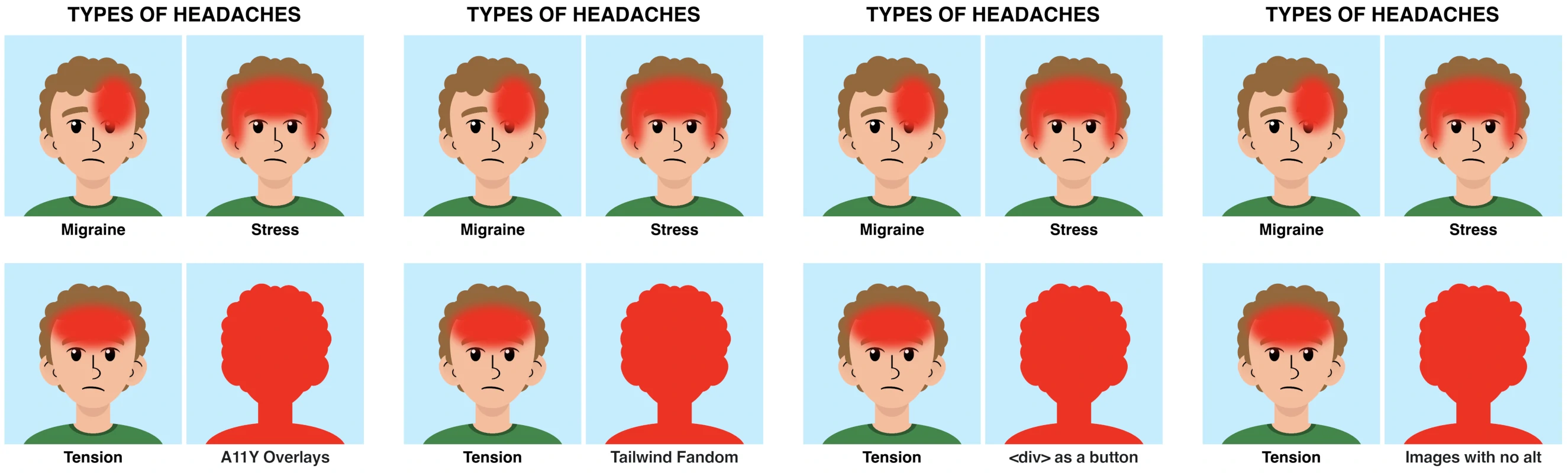
CSS Shots: Anniversary edition
comiCSS turns 2 next week. And to celebrate, I will be publishing a cartoon a day for the whole week.
They will be small cartoons with CSS code descriptions.
The end of the joke was Tailwind (an usual target along with JavaScript, which is to be expected from a site that is all
about CSS), but it's all in good fun. You have to use what you have to use. And Tailwind is as good or as bad as you
choose to do it. It just happens to be popular right now, and has a really vocal (and kind-of sensitive) fandom.
Here are some of the alternatives that I considered. Most are related to web accessibility, and some others are a bit
poignant. I hope you enjoy them.
<div> used as a button
Images with no alt
Color contrast issues
Tailwind Fans
Divitis
A11Y Overlays
Poor SEO
Some of the alterntives for today's comic
I hope you liked this comic strip. Until next week!
GoldiloCSS and the Three (Word-)Breaks
Once upon a time, there was a girl named GoldiloCSS. She had lived all her life with three bears
in a cabin in the forest and wanted to get out and see the world. She knew there was more to life
than sleeping and eating porridge and honey all day.
So, GoldiloCSS decided to apply to Med School and prepared her bio (in HTML format for some weird
reason that is not important to this story), but she soon found a problem: there were really long
words, and they made the lines look terrible and unbalanced. Luckily for her, GoldiloCSS knew CSS
(thus her name) and tried the word-break
property.
She first used word-break: break-all, but all the words were breaking instead of wrapping if
they fit inside the following line. It was tough to read. She looked at the breaks and said,
"These breaks are too hard."
GoldiloCSS then usedword-break: keep-all. This time, the words wrapped correctly if they fit in
the following line... but if they didn't, they kept going and overlapping other parts of the bio.
That didn't look great either, and she complained, "These breaks are too soft!"
Finally, GoldiloCSS used word-break: break-word. In this case, if a word fit in the following
line, it would wrap, and if it didn't, it would break the word over several lines. She looked at
the text, and it was more balanced. She said, "Just right! ...or kind of?" because the long words
still looked weird when broken.
That day, GoldiloCSS learned several lessons:
word-break is a powerful property,
there are other useful properties for breaking words like hyphens or overflow-wrap,
the way a word breaks affects readability and accessibility.
After finishing writing her bio, she was tired. She ate some porridge and slept for a while. That life wasn't that bad after all; she wanted to enjoy it before her next adventure.
Riddle: Divtober is over... or is it?
This week's cartoon is an interactive joke! My children told me a (terrible) joke the other day:
Who comes in Christmas saying "Oh Oh Oh"?
Santa Claus walking backwards!
And as terrible as I am, I decided to create a CSS version of it. As a fun fact: the whole cartoon
(interactivity and all) is a single HTML element:
The "Ho Ho Ho!" is linear and radial gradients
Santa is in the background of the element
The question is in the ::before pseudo-element
The answer is in the ::after pseudo-element
It uses 3D CSS to make the card flip
It uses the backface-visibility property to avoid leaking the content we don't want from one side to the other.
Who said Divtober was over?
Coincidences?
The other day, Alicia Sykes shared a meme on DEV
about JavaScript, correlation, and causation. And I loved it, so I decided to try make a CSS version of it. And the result
is today's comic.
It actually was incredibly easy to code, and I tried to make it as accessible as possible (maybe too much): adding semantic
HTML, each planet has a role of image with an accessible description (with aria-label and title), and same for the crosses
and check mark, the table has a caption, the table headings specify their scope and are used as descriptions for the cells...
It is not perfect, and it may be too much, but it was fun to code it that way.
I like this meme because it works at so many levels and for almost anything you choose:
Tailwind? It works.
JavaScript? It works.
TailwindCSS? It works.
CSS? It works.
ASP? It works.
Tailwind? It works.
PHP? It works.
Tailwind? It works.
Did I mention it also works with Tailwind? 😈
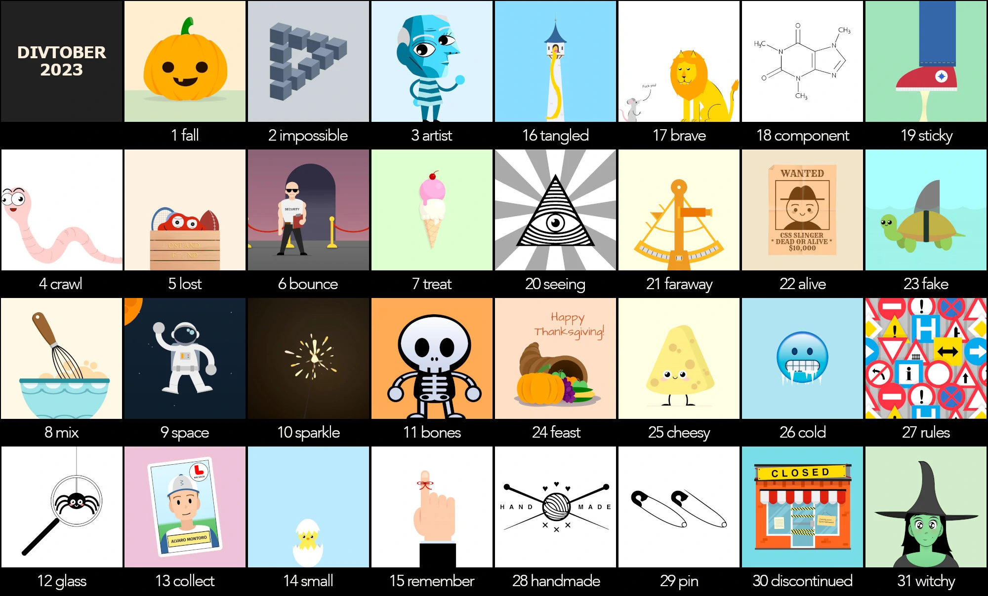
Divtober
I took a short break from comiCSS to participate in Divtober. Divtober is a coding challenge in which
developers draw with CSS based on a daily word... but with a catch: they can only use a single element
(preferable a <div>, thus the name of the challenge).
These are the single-div drawings I did for this 2023 Divtober:
You can check those CSS illustrations and many more on CSSdrawings.com.
Now, back to comiCSS :)
2023 is CSS year
This year of 2023 has been fantastic for CSS development. It seemed like JavaScript got all the love in the past, while CSS was relegated to a secondary role, even when it is an essential part of the Web.
But 2023 has broken that tendency. We get a new feature definition or browser supporting a new (or old) property almost weekly. And it is incredible... until it won't happen. And it will happen that CSS retakes the back seat, and JavaScript gets back all the attention sooner rather than later.
Let's enjoy this time and hope that the tendency slows down progressively so we can keep getting more and more features—just my two cents.
Mafalda was a comic by Argentinian cartoonist
Quino that ran in the 1960s and 1970s,
and that became incredibly popular in the 20th century, and well into the 21st century.
Quino and Mafalda are a great source of inspiration. I already did a cartoon inspired by Mafalda), and that
was the case for today's comic, too! In the original, the little girl Mafalda looked at the sun
amazed by how it's the same sun that inspired Pasteur, Bach, Shakespeare... and begs the sun to spread that same inspiration.
The idea is the same, but instead of a little girl being amazed by the sun, it's an undefined character/developer amazed by the
typical red border that is used at times to debug in CSS (and that was part of this cartoon or
this other cartoon). This could be the same red border that helped many other good developers learn and grow,
so the character asks for inspiration to keep growing.
While a red border can be helpful to highlight some issues with CSS (using outline instead of border, so
the border doesn't mess with the element's size), there are better ways to debug CSS. The Developer Tools on the browsers have
advanced considerably in the past few years, and provide more tools to analyze each element individually. You inspect the element,
and the browsers provide information about the rules that apply to each element, which one takes precendence (and why!), etc.
Ahmad Shadeed wrote a book about how to debug CSS,
and goes into details and code on the best ways to do it.
A fun fact: I used text-wrap: balance in a CSS art for the first time. It may sound like something silly, but it made
it super convenient to balance the text in the panels in a more natural way.
If it looks like a duck...
The Duck Test implies that the simplest conclusion is most likely correct. It is commonly phrased as "If it looks like a duck, swims like a duck, and quacks like a duck... it probably is a duck."
This cartoon is half tongue-in-cheek, half serious. Whenever I post a CSS drawing or a comic from comiCSS online, someone says, "CSS should not be used for drawing!"
Which is technically correct, but how accurate is it? In reality, CSS is a styling language but, for not being a graphic design/graphic/drawing language, it sure does have many features that graphic/drawing languages have: filters, masks, gradients, blend modes, clippings, etc...
I once drafted an article titled "Could CSS be the future of web imaging?" (which I never published as I never found the power to finish it). In the article, I compared CSS to SVG and Canvas. Many things have happened since I wrote it, and it has become partially outdated (things that happen when you don't finish the article when you should 😓)... maybe I'll finish it one day.
Going back to the "CSS should not be used for drawing," my answer is this new CSS drawing (I'm getting old and a bit stubborn).
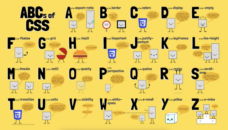
ABCs of CSS
This week's comic/cartoon is a "small" project
that I had been planning for a while, and it took a little bit longer than expected to
complete. It was inspired by a series of cartoons that I saw in Spanish satirical
magazine El Jueves.
Some of the letters are interactive (like the "R for resize") and some are animated (like
the "K for keyframes" or the "Q for quotes"). But that is not really shown on the static
image version, so they may look a bit weird. You should check the
live demo linked on the comic page.
July 10's comic: ABCs of CSS
As always, it is coded in HTML and CSS (although this time I did it with SCSS instead of
native nesting because I found some issues, then exported the compiled CSS). You can check
the source code from the demo, and change the font-size of the article on line 27 to make
the cartoon larger and easier to read. (If you make it too small, you may hit a bug with
mix-blend-mode on Chrome.)
I had in mind do the "ABCs of CSS Art" and the "ABCs of HTML", but seeing how much this
one took me, maybe I should chill on those a little (although I already started the CSS
Art one). We'll see how that goes.
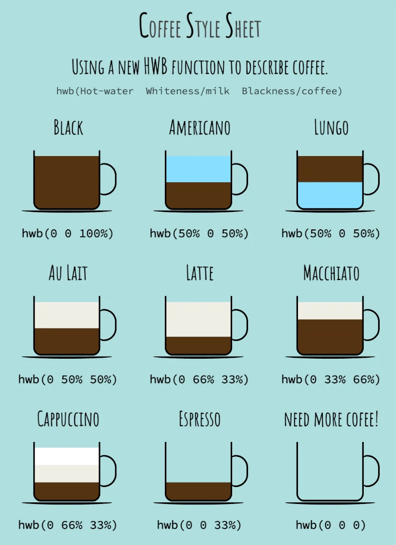
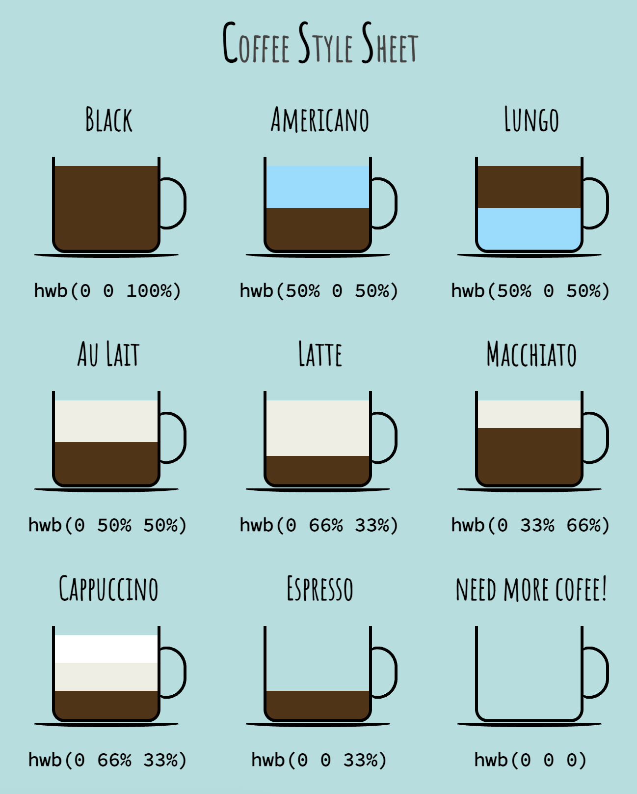
Coffee Styling Sheet: Coffee as a CSS Color
They say developers could work only for coffee. I don't think that's true (but maybe
not too far either). So this week's cartoon will mix two of my favorite things: coffee
and CSS. And in particular, I will focus on CSS colors and how different types of
coffees can be represented similarly to CSS colors.
We all know about RGB, Hex (also RGB), and HSL (which, funny thing, is also RGB). And
new color formats have popped up in the CSS standard: L*a*b*, LCH, CMYK, HWB, OKLCH...
So many people have asked me, "Why do we need so many color formats in CSS?" And
that is a fair question that I will try to answer with today's cartoon.
And I will do it with the help of an existing CSS color function: HWB. Although HWB
stands for Hue-Whiteness-Blackness, I modified the letter meanings (just) a little to
fit my purpose:
H = Hot water = water (duh)
W = Whiteness = milk (foamed, frothed, steamed, etc.)
B = Blackness = coffee (the cause of, and solution to, all of life's problems.)
After this long introduction, finally, here's today's cartoon:
I probably should add a description at the top explaining what HWB stands for...
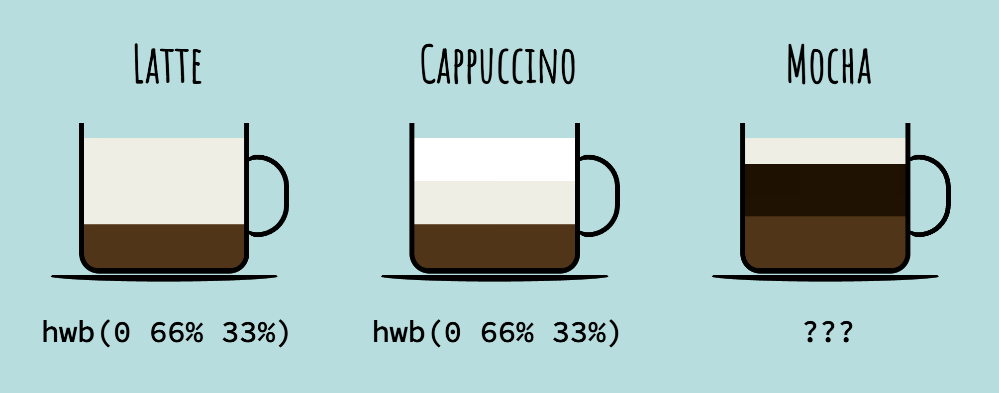
While I like the idea, it is limited: how about if we want a mocha? Mochas have chocolate
and hwb() does not have a way to represent chocolate. It's only water, milk, and coffee.
With those three basic ingredients, we only get to create the coffees on the infographic
and some more (cortado, café bombón, or galão, to name a few). Still, we are missing a ton
more: Irish coffee, espresso romano, marochino, etc., and we cannot create them with just
water, milk, and coffee.
Even for the ones in the cartoon, my newly created hwb() function is not enough. For example,
check the cappuccino: it is 66% milk and 33% coffee. It seems misleading that it has the same
composition as a latte, but they are not the same: in a cappuccino, the milk is half steamed
and half foamed.
It would be nicer if we had a different way to express those details. And that's what happens
with CSS colors too! We have been using RGB for a long time, but RGB is limited. The
CSS Color Module Level 4 introduced new ways
of writing colors that modernize the web and bring a world of possibilities: Lab, LCH, OKLCH,
CMYK, the color() function... and those color spaces offer more options than the standard RGB.
In the case of a mocha, we are missing the chocolate (which is not an option in HWB)... so why
not use LCH instead?
L = Lightness/Leche/Lait/Latte = Milk
C = Chocolate
H = Hot coffee
Now we could use that function to do lch(20% 40% 40%) and get a nice Mocha. And notice how
some of the coffees in the chart can be defined with LCH (basically all except the Americano
and Lungo.)
And same thing happens to the CSS colors: some color functions will allow you to create more
vibrant colors than others, and some will be easier for the computer or more straightforward
for humans. Some overlap is expected, and that's completely normal. Pick the best color format
for your project needs, and enjoy. It is an exciting time to play with CSS colors.
If you want to read more about color functions, check directly the CSS Color Module 4
(and level 5 for some great new color functions!).
They are surprisingly straightforward. You can also check
an article
I published a couple of years ago... but be warned that it is a bit outdated as the standard has
changed continuously since I wrote it.
How is comiCSS drawn?
Some people have asked me: "How is comiCSS drawn?"
comiCSS cartoons are coded in HTML and CSS, but how? Is it an AI generating
the code? No... although it would be interesting to see the results.
An opportunity for further testing. Is it premade things? No, although
I must admit that sometimes I copy-paste from previous strips to save time,
most of the cartoons and comics are coded from scratch.
I have shared some of the drawing processes on this
YouTube playlist (click on the videos to open them in a new tab):
There are more videos on how the cartoon is drawn. You can see them linked at
the bottom of the cartoon/comic. I could put the link in a more visible location
so it is more apparent that there is a video with the recorded process.
I have to admit that this process is tedious and slow (each cartoon takes 30-60 minutes),
and I've been toying with the idea of streamlining the process by working on a mini
CSS utility-class library that would allow me to create characters with different
expressions, just adding classes. The main issue:
I still need to develop a fully defined style or set of characters. I could do it easily with
the undefined character from the first comic
(which is reappearing but not recurring enough to make it its own library?);
or even with the Batman/Robin characters
(but there are only so many gags that can be done with those two... without
getting a cease-and-desist letter from DC.)
Creating that library will save me time in the long run and allow me to produce comics
faster, but the characters may not be polished enough for it. So we'll see how it goes.
Flex-Wrapping
Rap battling (or battle rap) is a type of rap performance in which
two or more rappers sing against each other (generally including some insults/attacks). Today's comic
plays with the homophones Rap and Wrap to make a silly joke with Flexbox and the
flex-wrap property.
A flex container will lay out the content in a single line by default. This may be Ok, but if the items' size exceeds the
container, they will be squeezed or they will overflow. So instead, we may want to get the content into multiple lines.
This is where flex-wrap comes into action.
This property defines if a flex container will be single-line or multi-line (depending on the amount and size of the flex items),
and in the case of multi-line, it defines how the items will be stacked after wrapping.
flex-wrap has three main values:
nowrap: the items will not wrap, instead they will overflow the parent. (This is the default value.)
wrap: the items will wrap instead of overflowing the flex container. They will stack from cross-start to cross-end.
wrap-reverse: the items will wrap instead of overflowing the flex container. They will stack from cross-end to cross-start.
The cross-start and cross-end part may sound complicated, but it is easier than what it sounds. It depends on the direction of
the flex: if the direction is horizontal ("row"), then the wrapped elements will stack vertically (in rows); and if the direction is
vertical ("column"), the wrapped elements will stack horizontally (in columns).
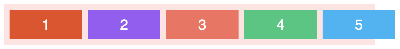
Let's check an example with a flex container with 5 items with a defined width. By default, the value of flex-wrap is "nowrap",
so the flex items will overflow the container (I put it as an image to avoid the annoying horizontal overflow it would create):
Now, if we change the code to set a value of "wrap" for flex-wrap, when the flex items would overflow the container,
they wrap into a new row instead (live demo):
12345
But if we set flex-wrap to "wrap-reverse", then the direction of the wrapping is the opposite: instead of
getting into a new row, the wrapped elements push the others into a new row.
12345
One last example with the flex-direction set to "column." In this case, the elements organize vertically
in columns, so when they wrap, they do it in columns instead of rows:
12345
I hope these examples were useful and that you enjoyed today's comic. Learn more about
flex-wrap on the following sources:
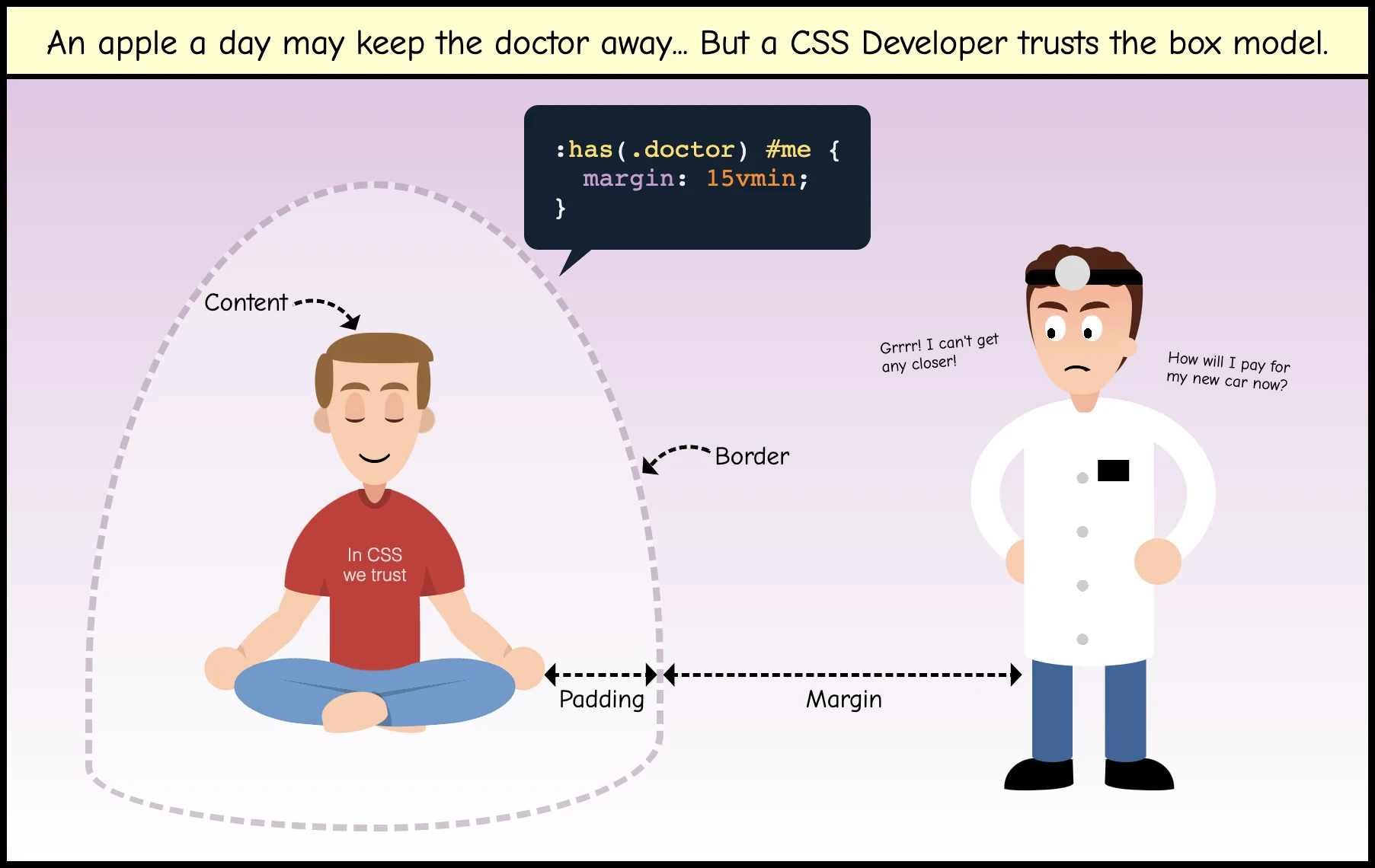
They say an apple a day keeps the doctor away... But does that apply to web development and CSS, too? Today's cartoon
tried to answer that question. I also coded an alternative version, a little bit more educational, highlighting the
parts of the box model using the same drawing:
The box model explained with a cartoon?
Hopefully, it is clear. Although I must admit, the dashed line marking the personal space is a bit weird and it can
be confusing (as it may seem like it's a force-field and the margin is actually between the person and the border).
CSS Christmas Carol
On the twelfth day of Christmas, my CSS sent to me...
A keyboard trap is a bad UI pattern in which a user can get into a component or element of our application using the keyboard,
but it is impossible getting out of it just by using the keyboard. Not to be confused with a focus trap, which is basically
the same, but with a keyboard exit (it may be a close button, or pressing Esc, or something like that.)
As you may imagine, a
keyboard trap is a HUGE accessibility issue. In contrast, a focus trap can be extremely helpful and positive for usability
and accessibility (e.g., a modal in which the focus is trapped until the user presses a button.)
I've had the idea of drawing a trap for keyboards for a while, but I didn't know if it would be clear what it was. I'm still
not 100% convinced about it. I like the idea, but I'm not 100% sold on this implementation. I settled for this text
(which may remind of a previous comic strip), but before I considered another option about testing and
trying to catch keyboards with a trap. I discarded that option because if felt too "technical" and not too good of an idea.
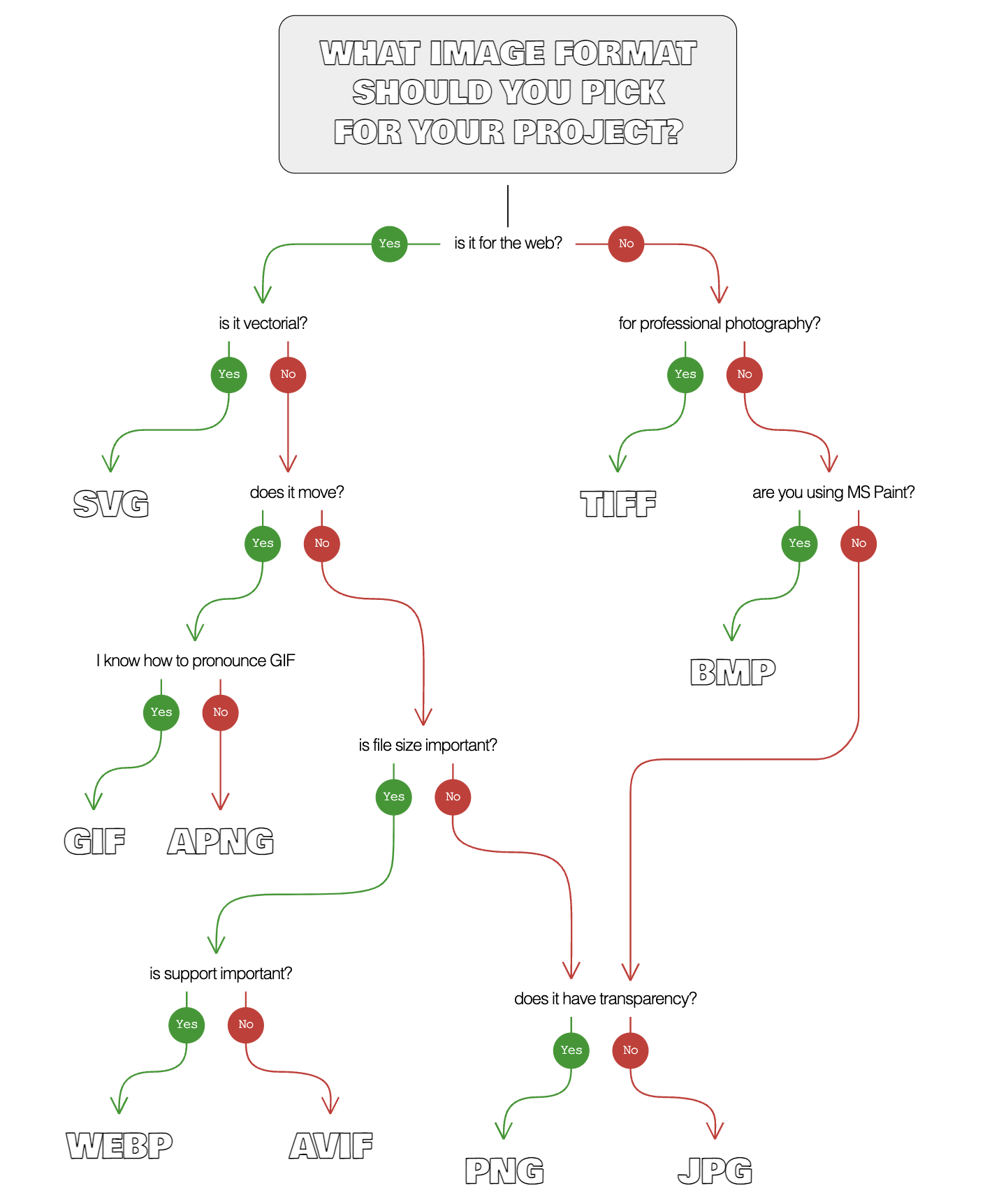
Image Format Decision Tree
I published a more serious article
about today's cartoon. It still includes some tongue-in-cheek questions, but the idea was to make it less of a joke
and more of an useful thing for people:
A more serious version of the decision tree
The article also includes additional information on why some formats should or should not be used, when we should consider
using a video instead of an animated image, and a love letter to BMP... well, not that last part. But I miss BMP.
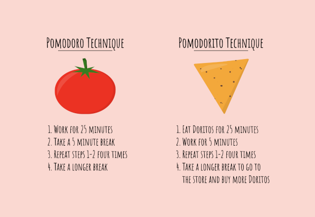
The Pomodorito Technique
You may have heard about the Pomodoro Technique, a time management method that consists of repeating work and break intervals to help keep focus while getting some needed rest. It is pretty popular in the US among tech employees.
The origin of the name is funny: the method's creator used a tomato-shaped kitchen timer to control the work/break blocks (Pomodoro means tomato in Italian). So that is why each work block is called a "Pomodoro."
The method is simple. First, you pick a task and then:
Work for 25 minutes.
Take a 5—10 minute break.
Repeat steps 1—2 four times.
Take a more extended break of 20—30 minutes.
I find this a productive time management method. I follow it often and keep a couple of timers at my desk while I'm working (although they are not tomato-shaped.)
The Pomodorito Technique
Alternatively to the Pomodoro Technique, I introduce you to the tongue-in-cheek Pomodorito Technique (not Lay's affiliated):
Eat Doritos for 25 minutes.
Work for 5 minutes.
Repeat steps 1—2 four times.
Take a more extended break to go to the store and buy more Doritos (you probably ran out at this point).
Alternatively, if you have a big stash of Doritos at home, you may use step 4 to take a nap. All that eating is exhausting, and some nice sleep will make digestion easier.
Not Lay's affiliated
While the Pomodorito Technique is more of a joke, it may be a good burnout index. If you find yourself trying the Pomodoro Technique but quickly spiral into the Pomodorito Technique, it may be about time to take some vacation... or start looking for a new job!
Today's comic strip is about CSS combinators (and the universal selector). But, what are they?
A CSS combinator is something that, combined with the selectors, gives them a relationship.
There are five CSS combinators (but one is at risk of not making the cut to the standard):
Descendant combinator (): indicates that the second element is a descendant (at any level) of the first one.
Child combinator (>): indicates that the second element is a direct descendant (first level only) of the first one.
Adjacent sibling combinator (+): indicates that the second element follows the first one directly in the code (first sibling).
General sibling combinator (~): indicates that the second element follows the first one in the code (any sibling as long as it's after the first element).
Column combinator (||): indicates that the second element is in the same column specified as the first element (this combinator is experimental and at risk of being removed)
The universal selector (*) selects everything (and that's why everyone in the bar cheers when the next round is on the universal selector.)
This was just a simple introduction to the CSS combinators. For more information, check the following MDN resources:
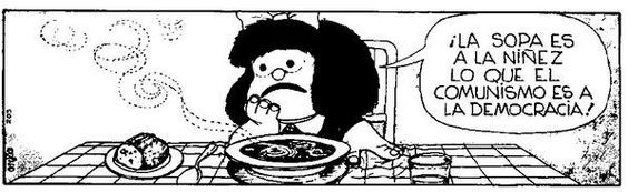
There is a classic Mafalda comic strip (by
Argentinian cartoonist Quino):
Image copyright by Quino
"Soup is to Childhood what Communism is to Democracy!" is a political message (cartoons can/should be
political at times) that could have different interpretations depending on the perspective.
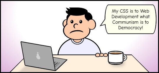
Based on it, I drew something simple. And because it uses CSS variables (custom
properties), it is easy to change the colors to something different:
A little homage to Mafalda and Quino
But I liked the black-and-white version betters, so I published that one. Also, I added more details
before publishing it on Monday (the table and t-shirt could use some extras).
Here is a video of how this cartoon was drawn from scratch to its (almost) final form:
Accent Color
Today's comicstrip is about accent-color,
so let's talk about it on today's blog post.
As the comic strip indicates, accent-color has nothing to do with the ability to write colors in
different languages. What it does, when supported —and it is widely supported now—, is allowing
setting up the "primary color" for some HTML elements and form controls.
This CSS property allows for a little standardization of the styles. In the past, each browser would style the HTML elements
differently (they still do); but now, developers have some control over how they will be displayed (at least,
on the color.)
Browsers allow to set up an accent-color in the following HTML elements:
Checkboxes (<input type="checkbox" />)
Radio buttons (<input type="radio" />)
Range inputs (<input type="range" />)
Progress bars (<progress />)
...So it begins
I've been doing CSS art for a while already. So it was a matter of time that I combined the CSS art hobby with something I
also enjoy, like graphic novels, comic books, or comic strips.
This website is my first attempt at building a place to put all the CSS cartoons I came up with and create an actual series.
Hopefully, the comic strips will come weekly, but that will depend on many factors.
I have to thank Temani Afif for
the encouragement to put this site together... and for coming up with the name comiCSS.
I probably would have delayed the creation of this website until I got a good name, and he came up with a great one in no time.


